Smarteyes
Giving Affordable Design a New Look
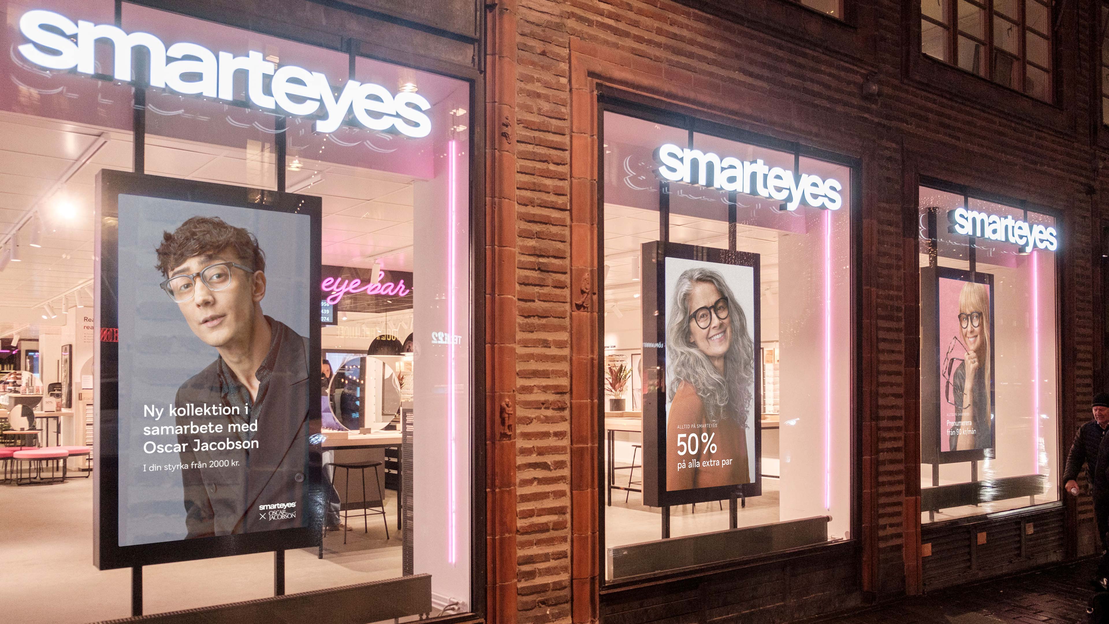
It sure is a challenge to get recognized as an optician in Scandinavia. Here, all major competitors are always on the lookout to match each other’s offers and they all share the same inital “S” to their name. Recognition and distinction has never been more important – you don’t want customers to end up with the wrong optician by mistake, do you?
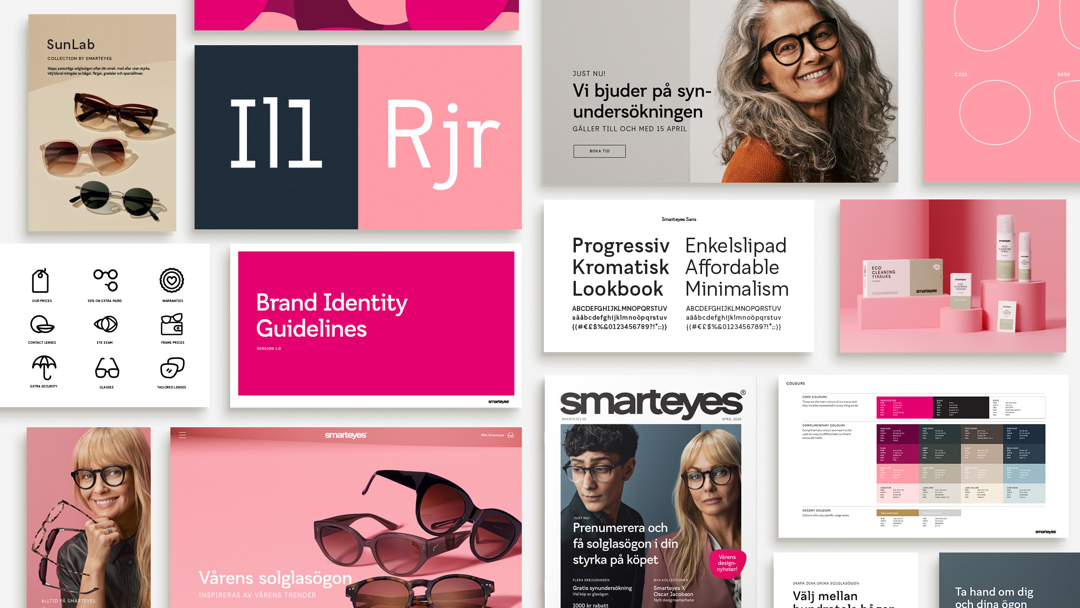
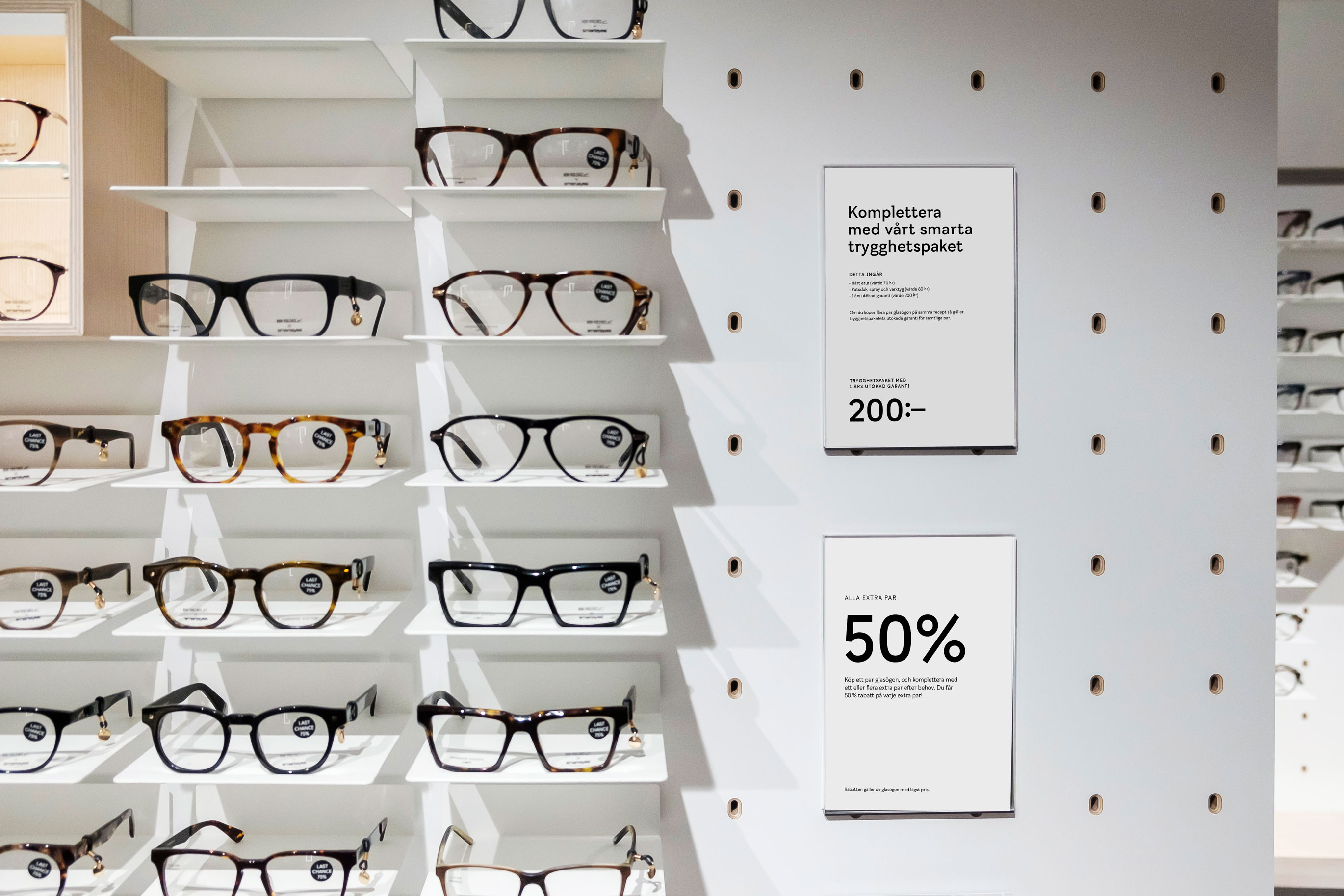
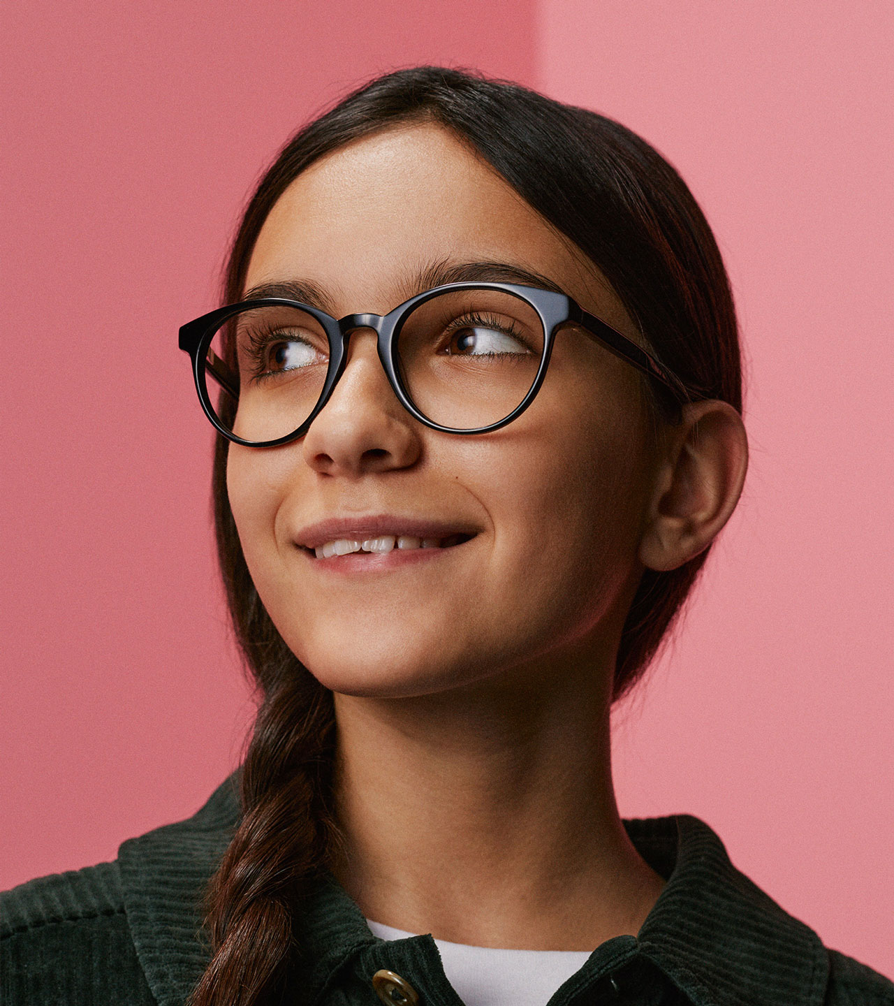
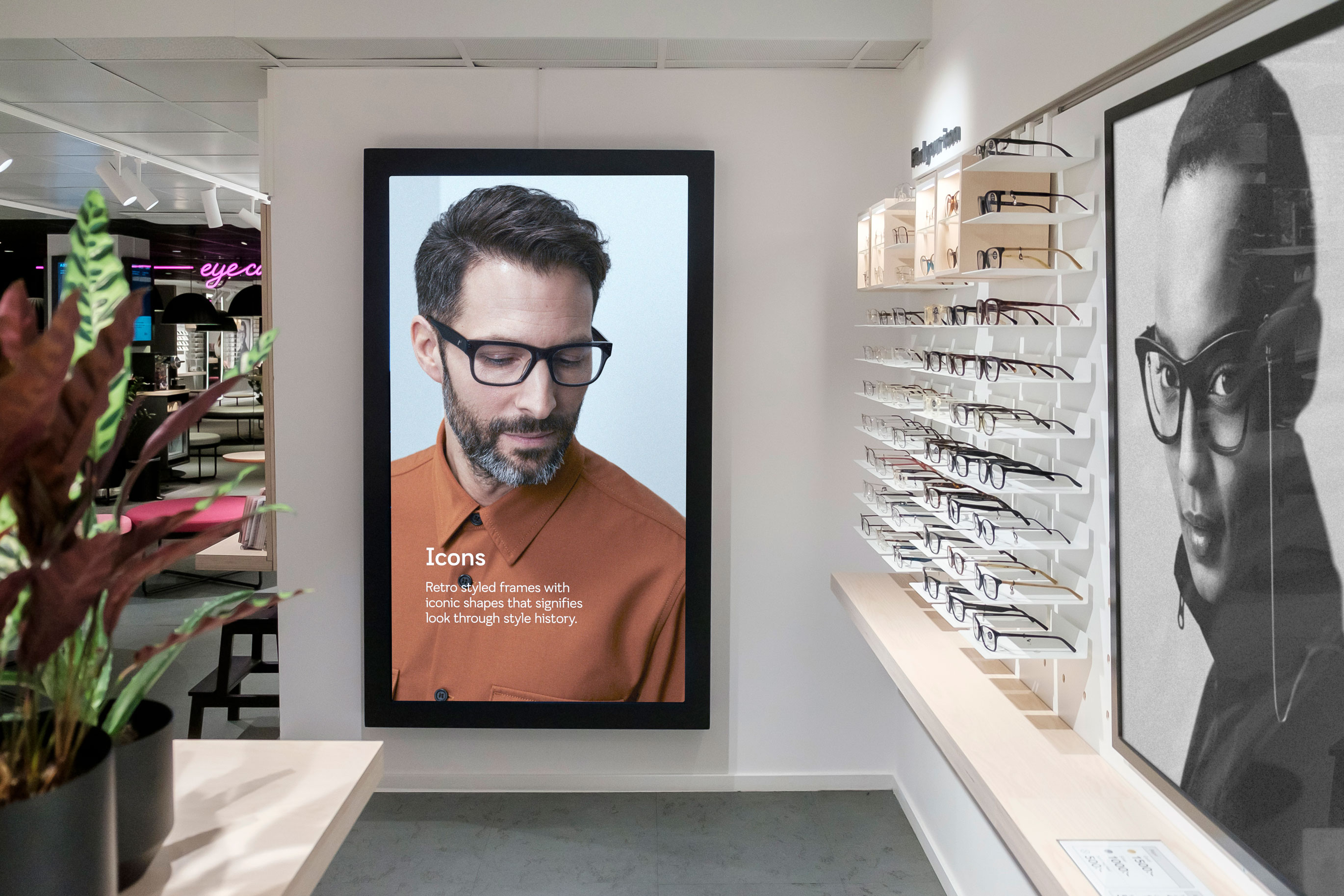
Coming of 2020, Smarteyes wanted to launch their new brand platform and alongside that, they wanted to update their visual identity with the goal to simplify and clarify. We had the honor to help them out.
The identity is funneled through the new brand platform and all parts are referable to Smarteyes philosophy, with the goal of lifting Smarteyes as a design brand even further.
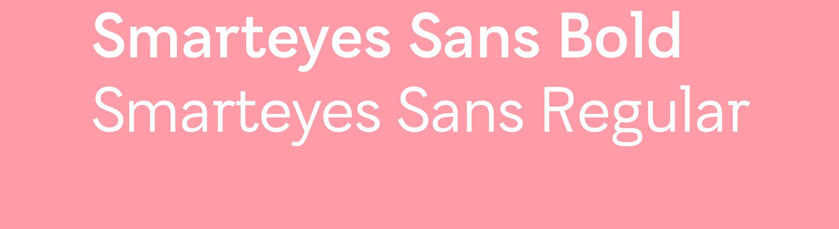
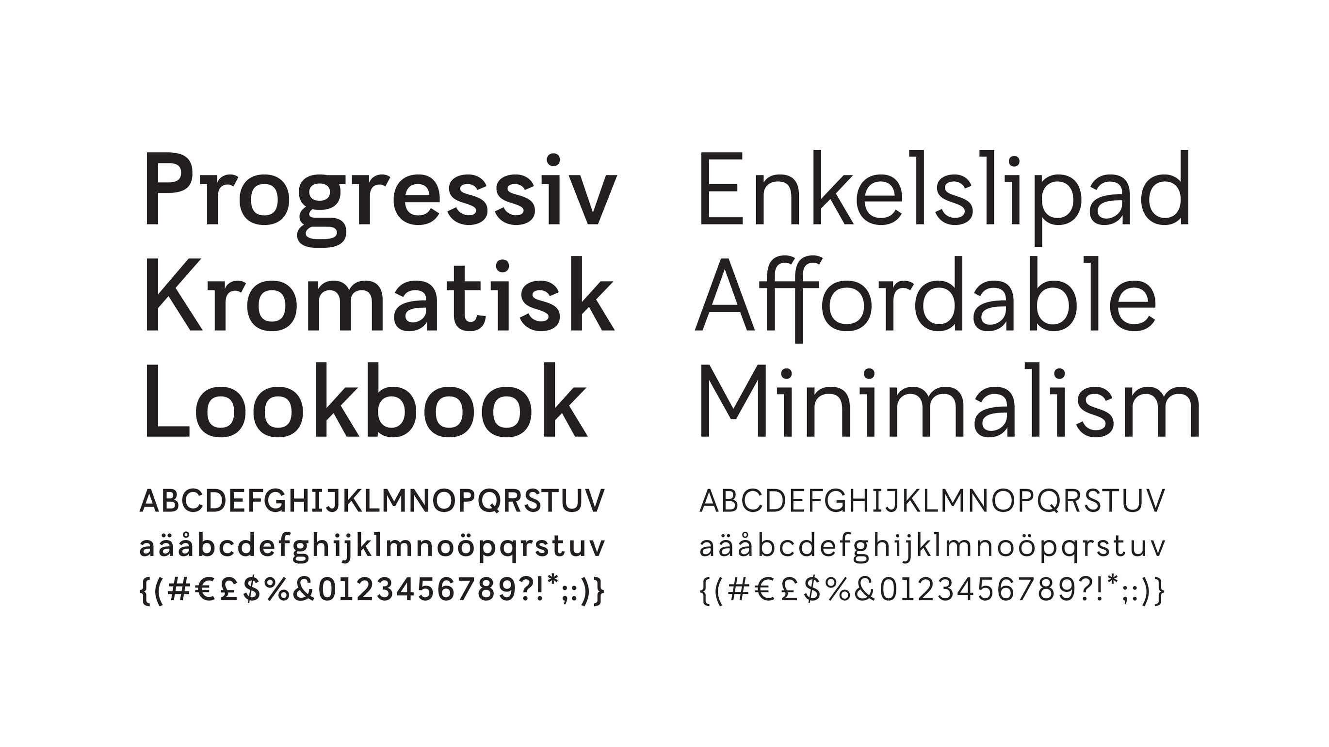
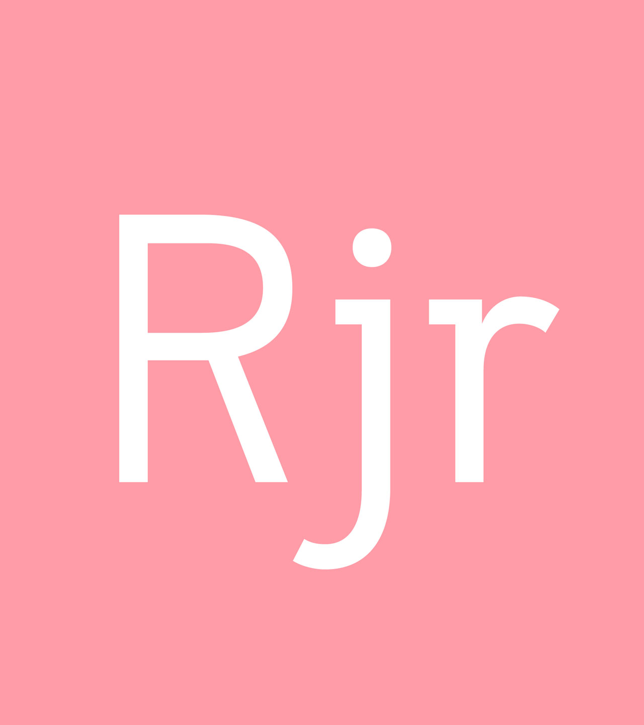
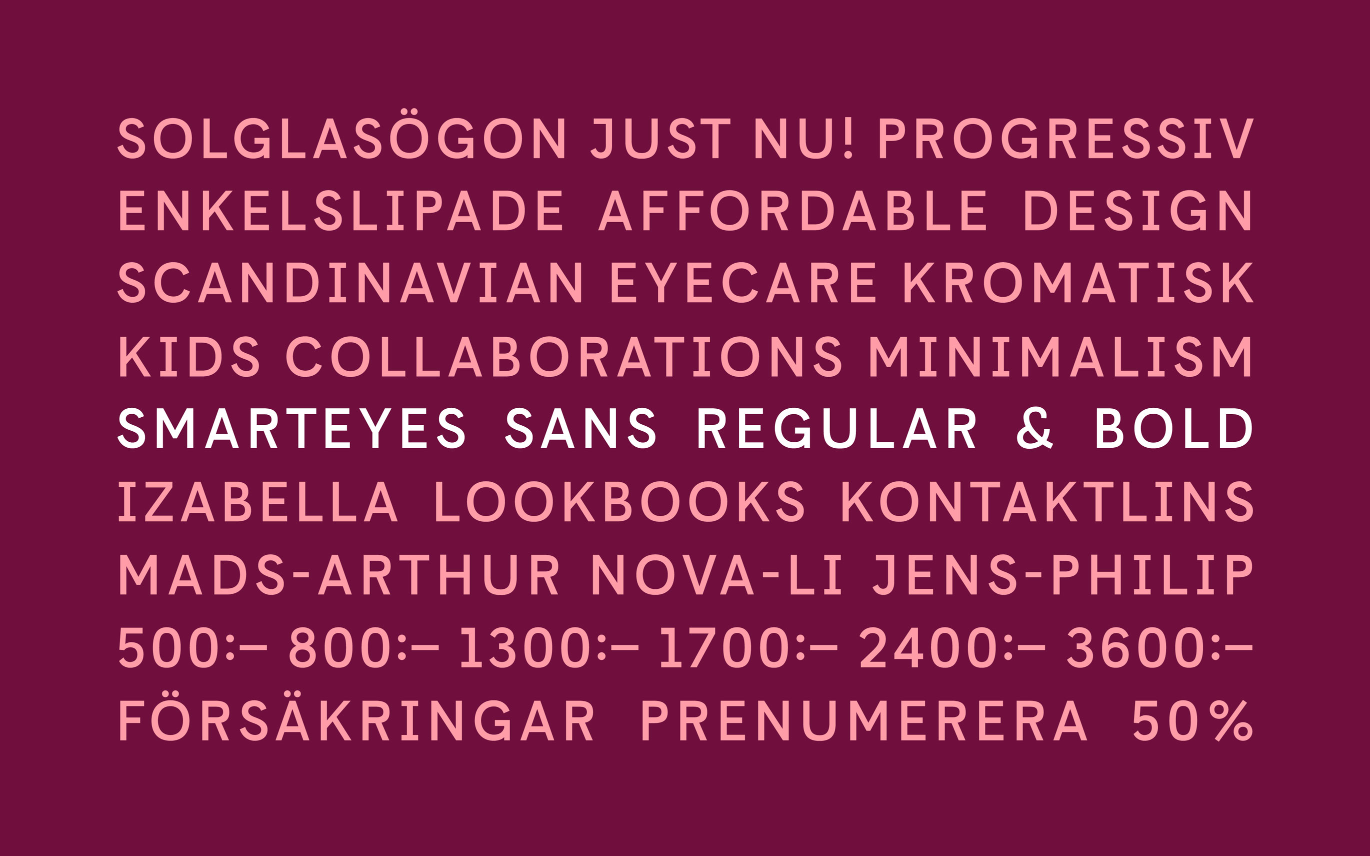
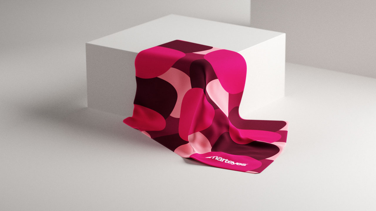
Smarteyes Sans – a custom typeface made for a brand that wouldn’t settle for anything less than designing everything themselves.


More work
-
Västtrafik - Gå på fram
-
The Dawit Isaak Library - The Bound Books Project
-
Ramlösa - Fluent as Water
-
Eriksberg - Julpåskölen
-
Malmö Konstmuseum - Visual Identity
-
Malmö stad - SFI IRL
-
Sandvik - The Impossible Statue
-
E.ON - The Jarnys
-
RFSU/Way Out West - The Livebrator
-
Skånetrafiken - Visualizing the journeys we make together
-
Läkerol - Makes people talk
-
Samsung - Make more of every moment