
Skånetrafiken
Visualizing the journeys we make together
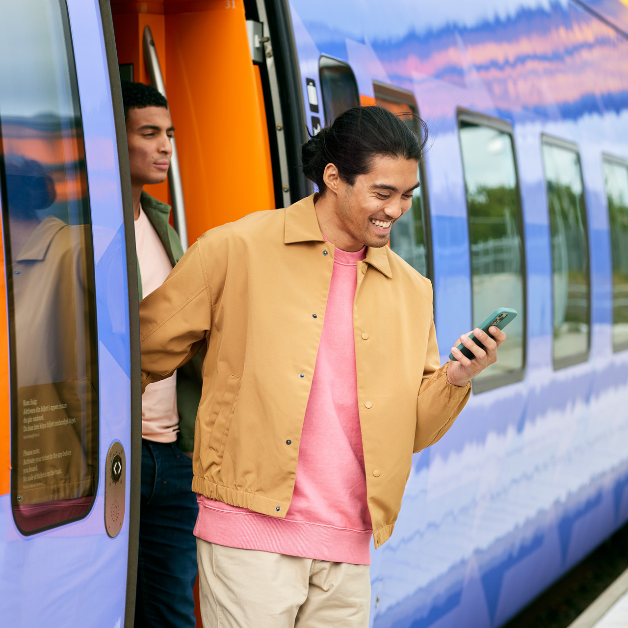
Managing regional public transport in the south of Sweden, Skånetrafiken needed to update its visual identity to meet new requirements for accessibility. There was also a need to refine and clarify the brand identity, so that it would visualize the whole experience of Skånetrafiken, long before passengers board the bus, train, or boat.
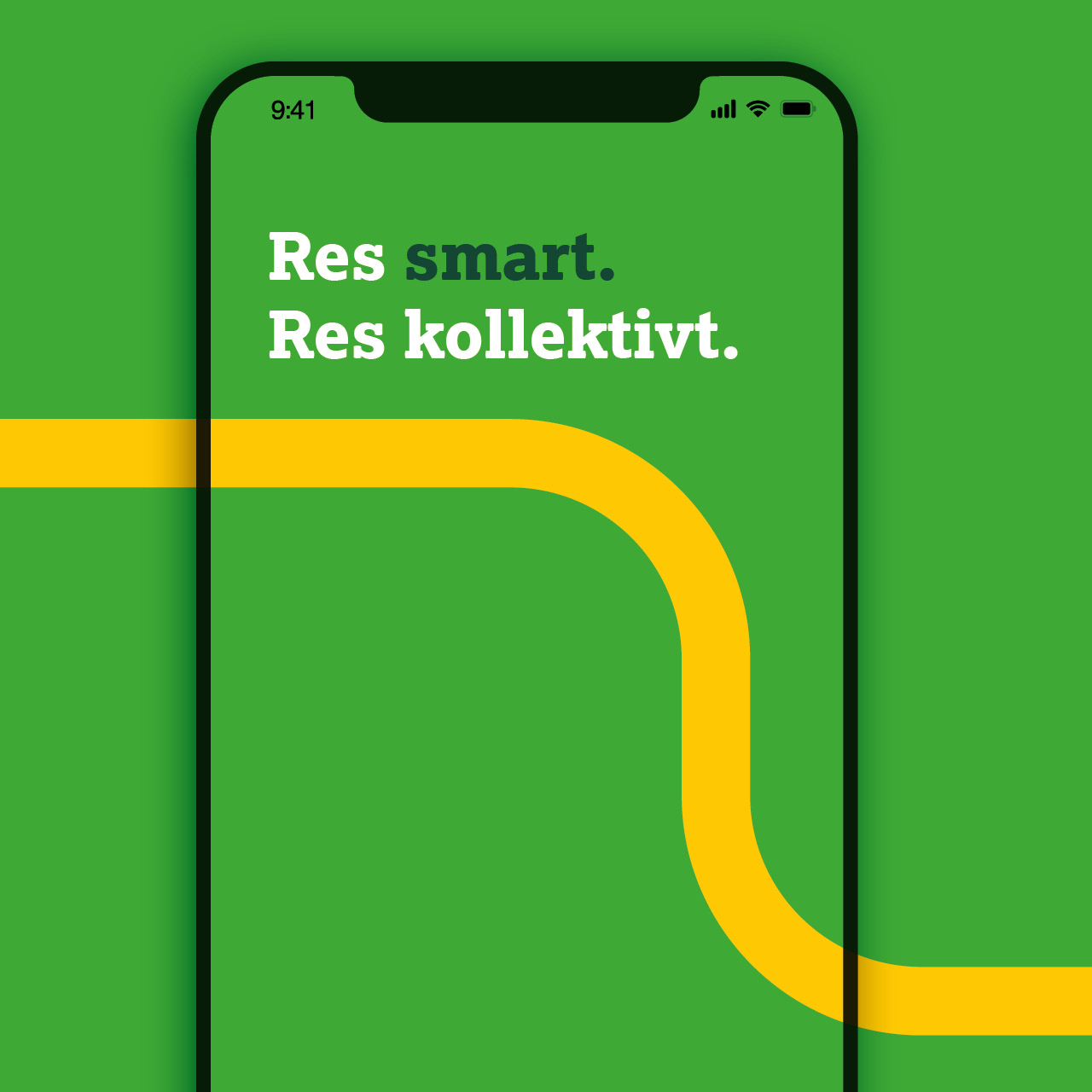
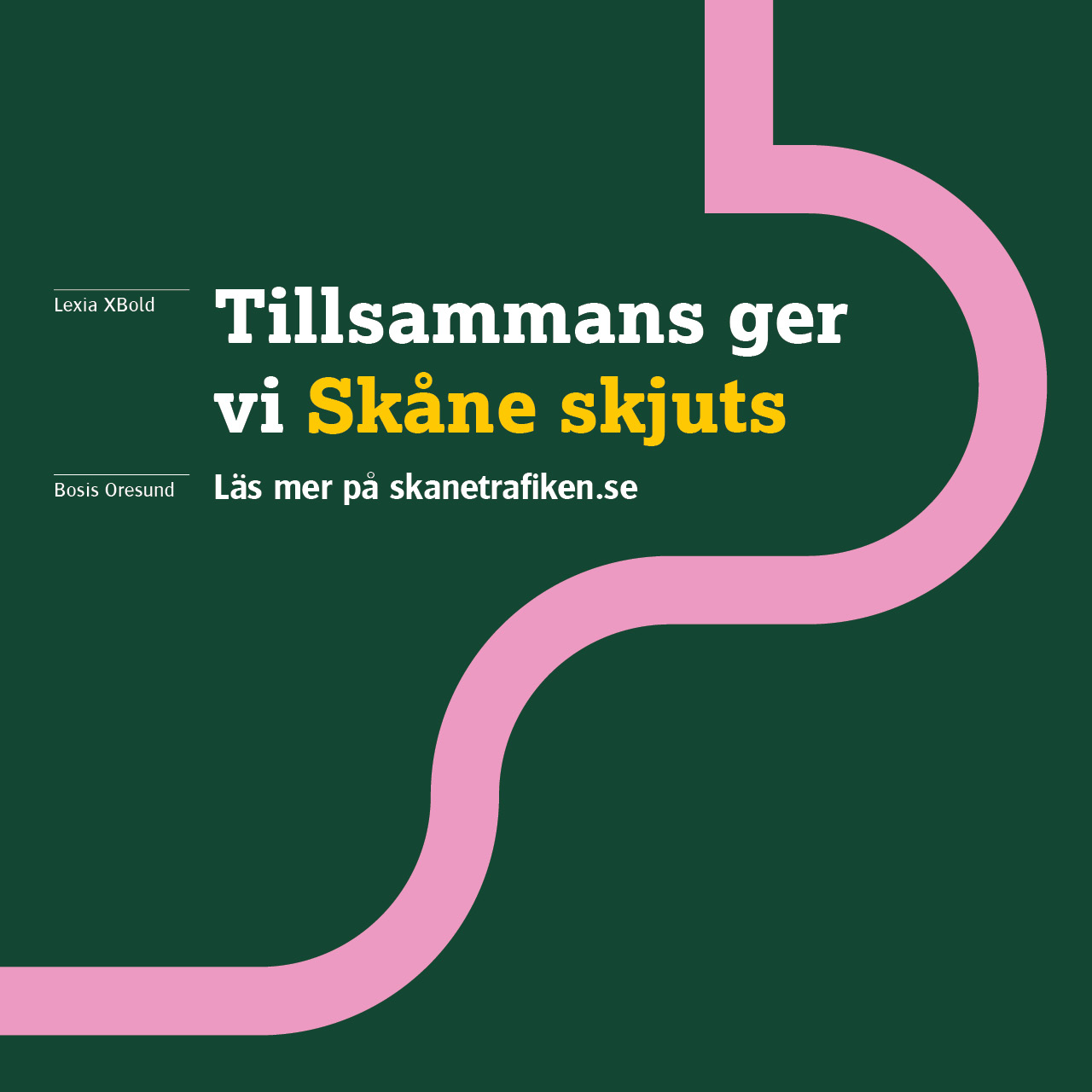
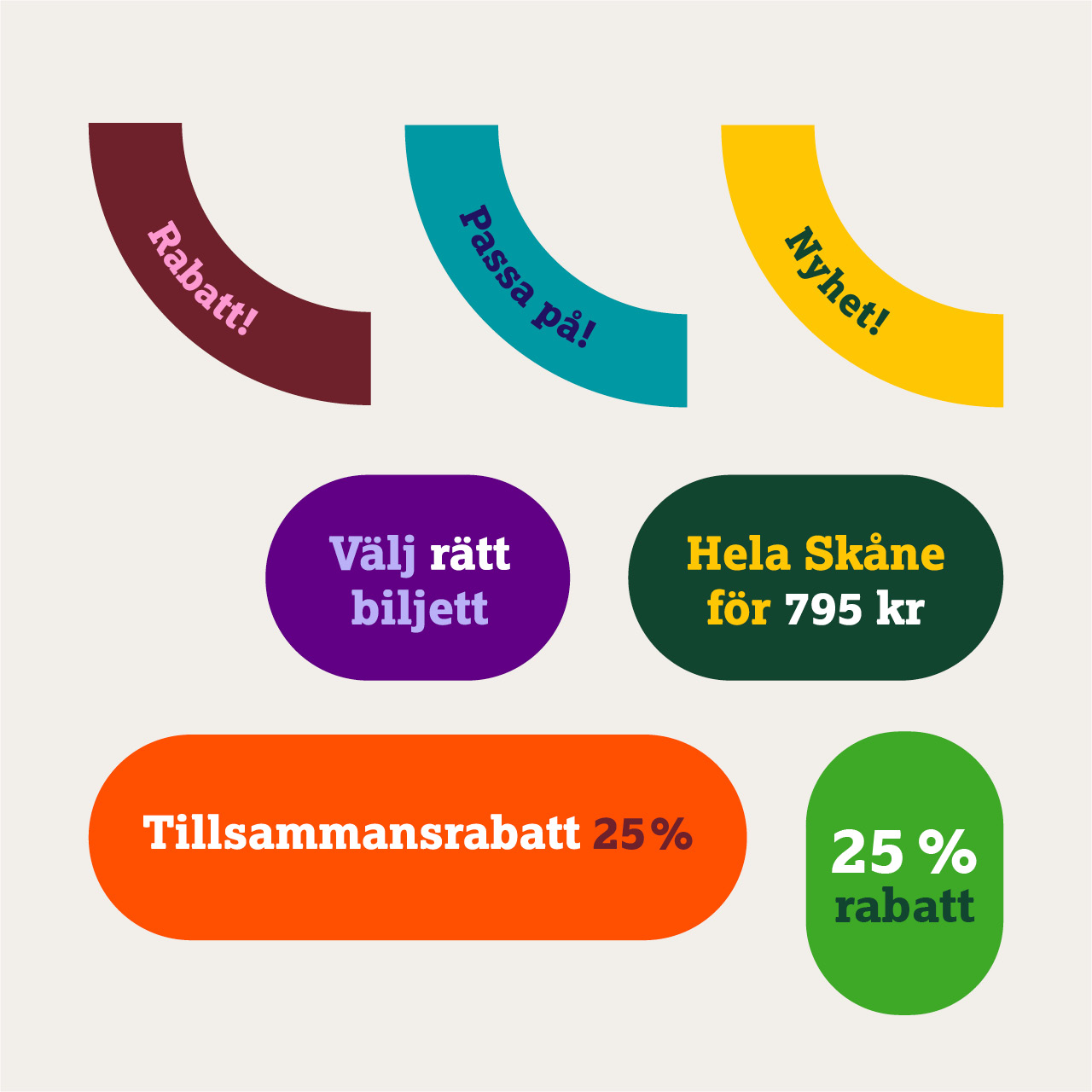
A connected graphic pattern depicts how Skånetrafiken offers transport, from A to Ø, regardless of time, place, or distance.
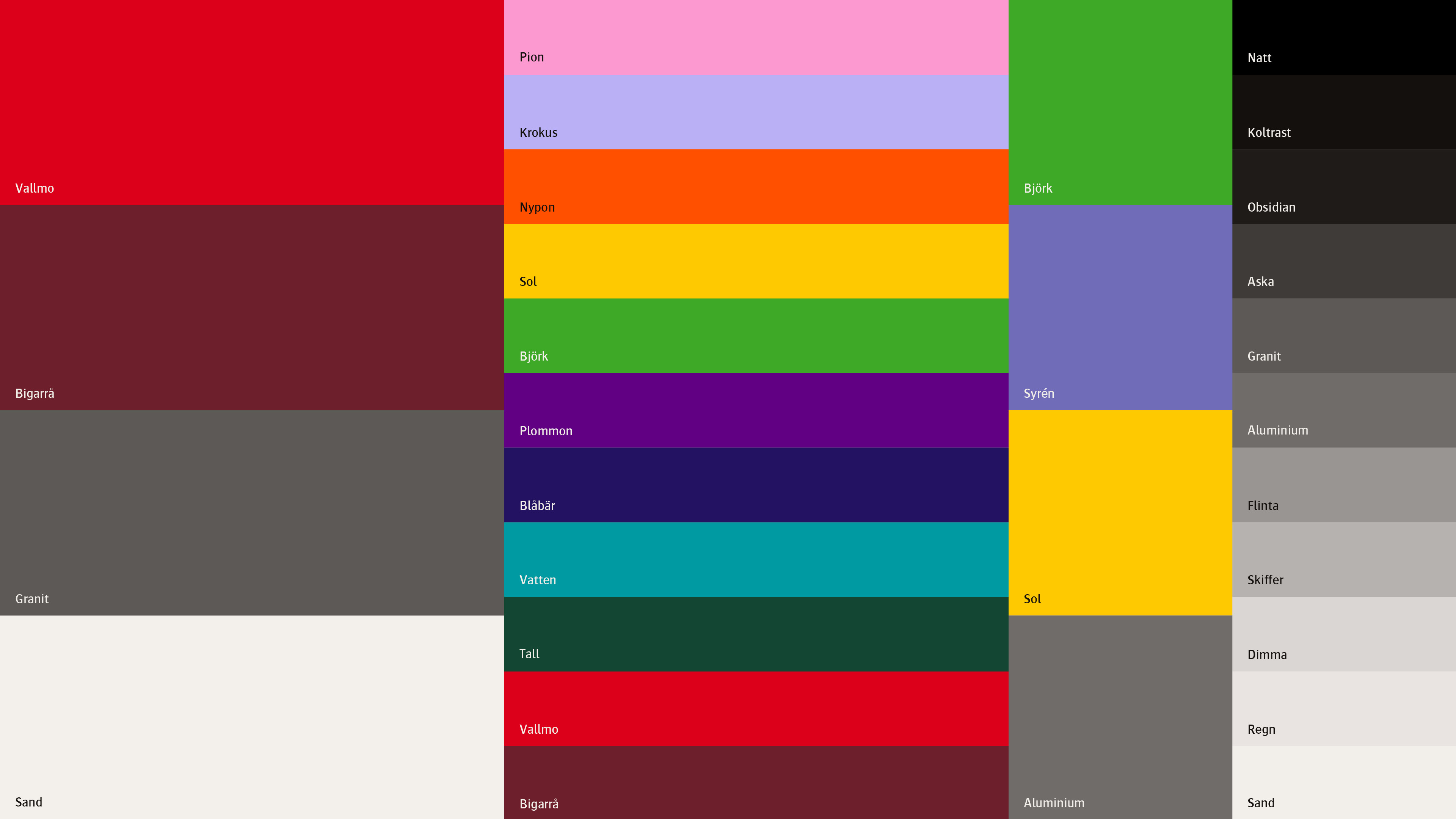
The warm and vivid color scheme welcomes all passengers on board, no matter who they are, where they’ve come from, or where they’re going.
More work
-
The Dawit Isaak Library - The Bound Books Project
-
Ramlösa - Fluent as Water
-
Eriksberg - Julpåskölen
-
Malmö Konstmuseum - Visual Identity
-
Malmö stad - SFI IRL
-
Sandvik - The Impossible Statue
-
E.ON - The Jarnys
-
RFSU/Way Out West - The Livebrator
-
Skånetrafiken - Visualizing the journeys we make together
-
Läkerol - Makes people talk
-
Samsung - Make more of every moment