HOJ
Visualizing the love of movement
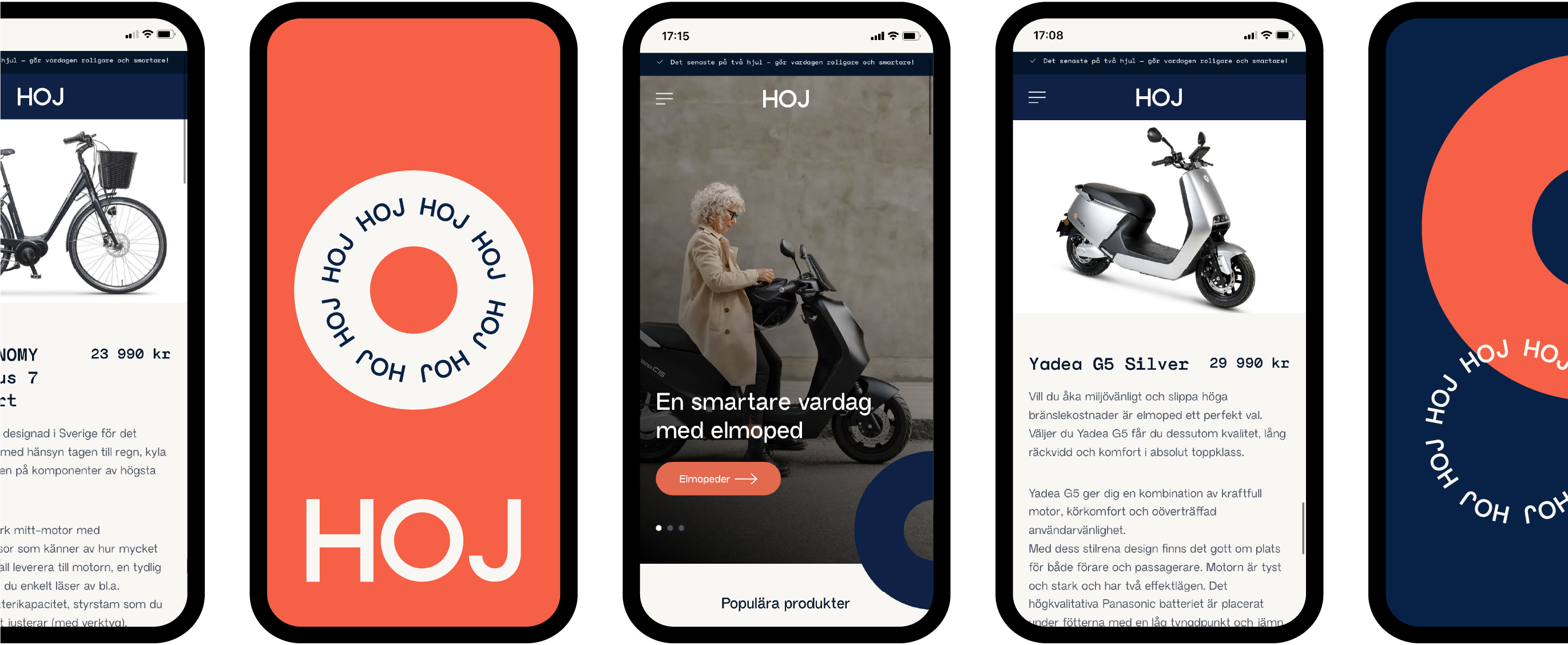
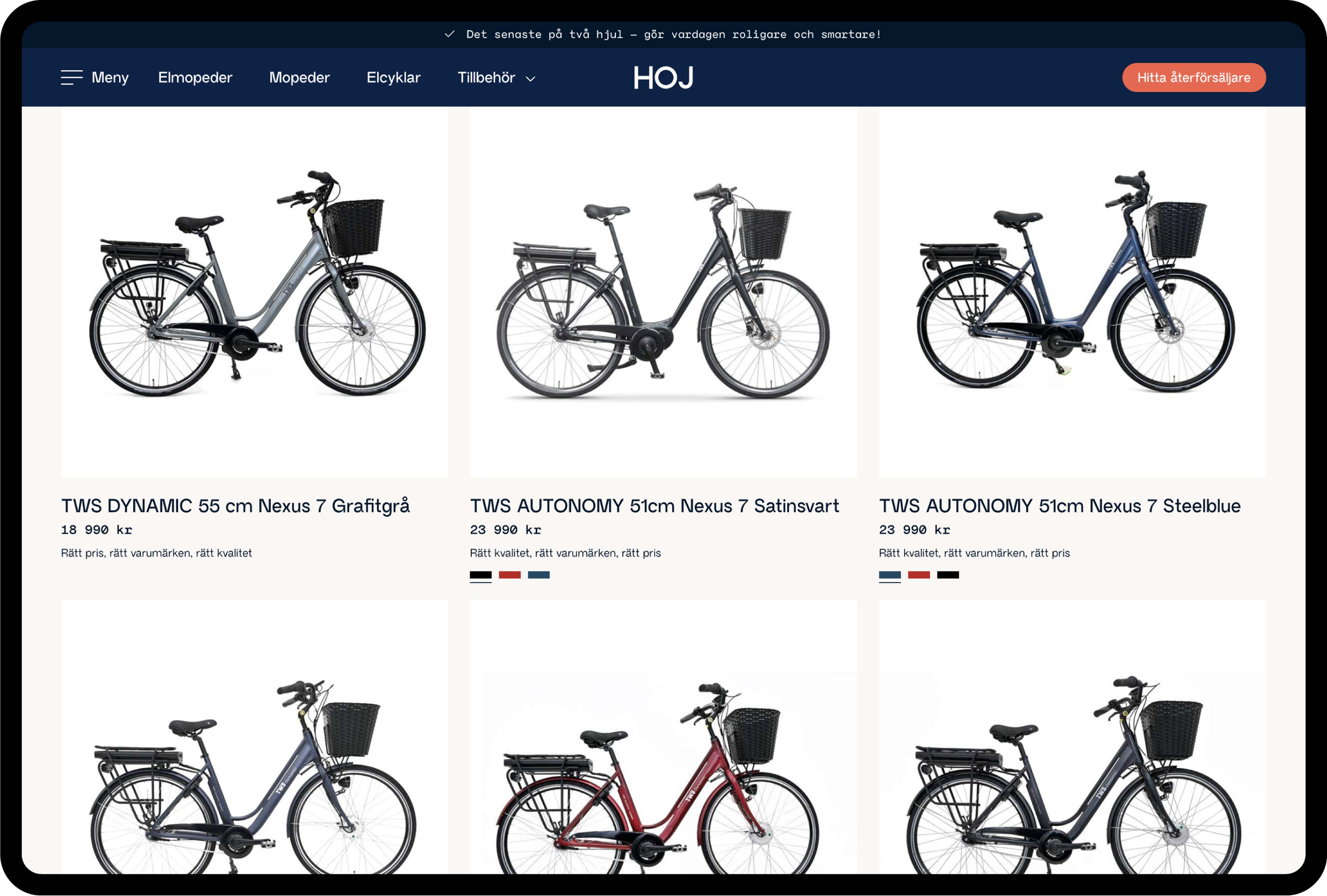
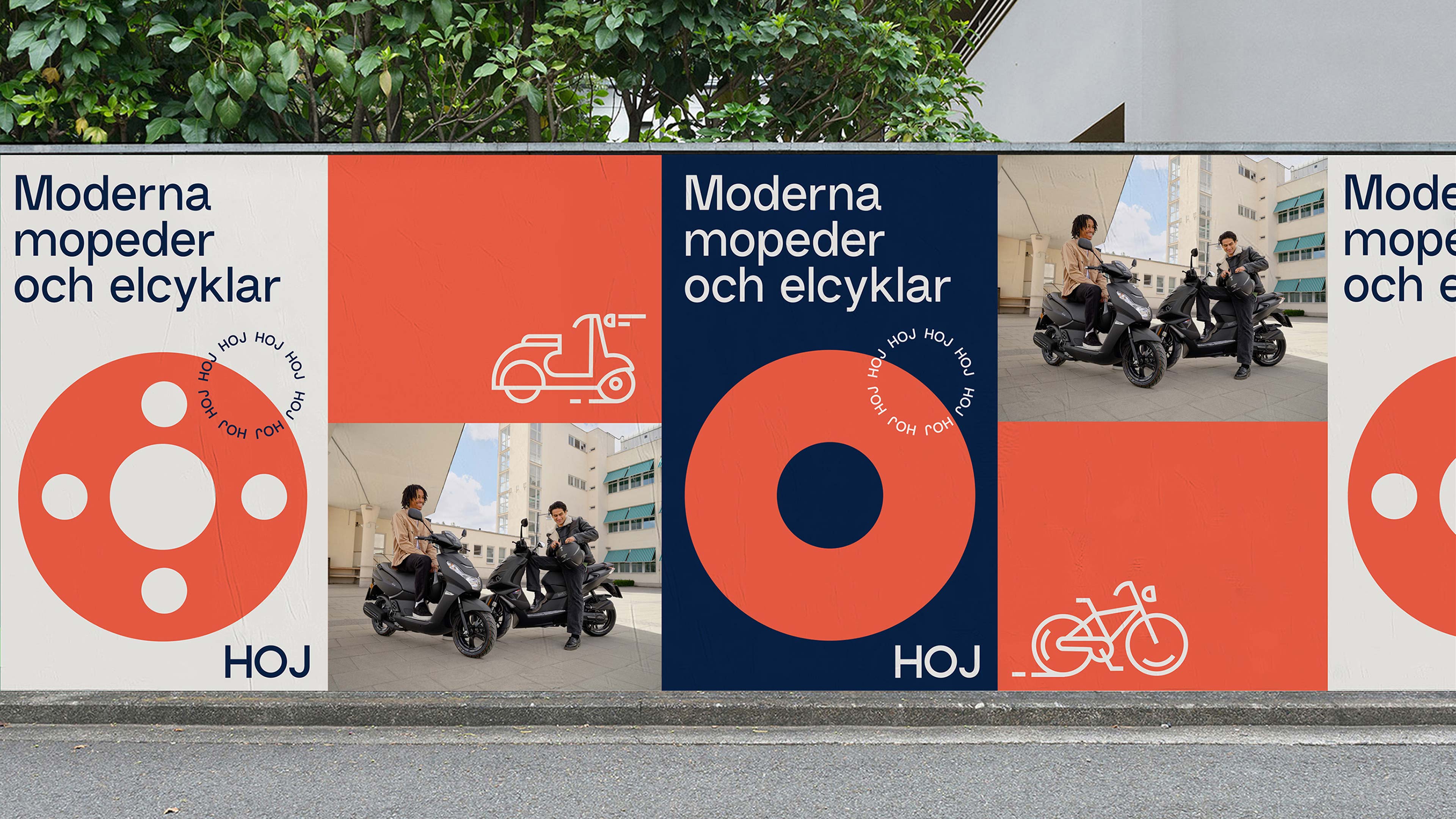
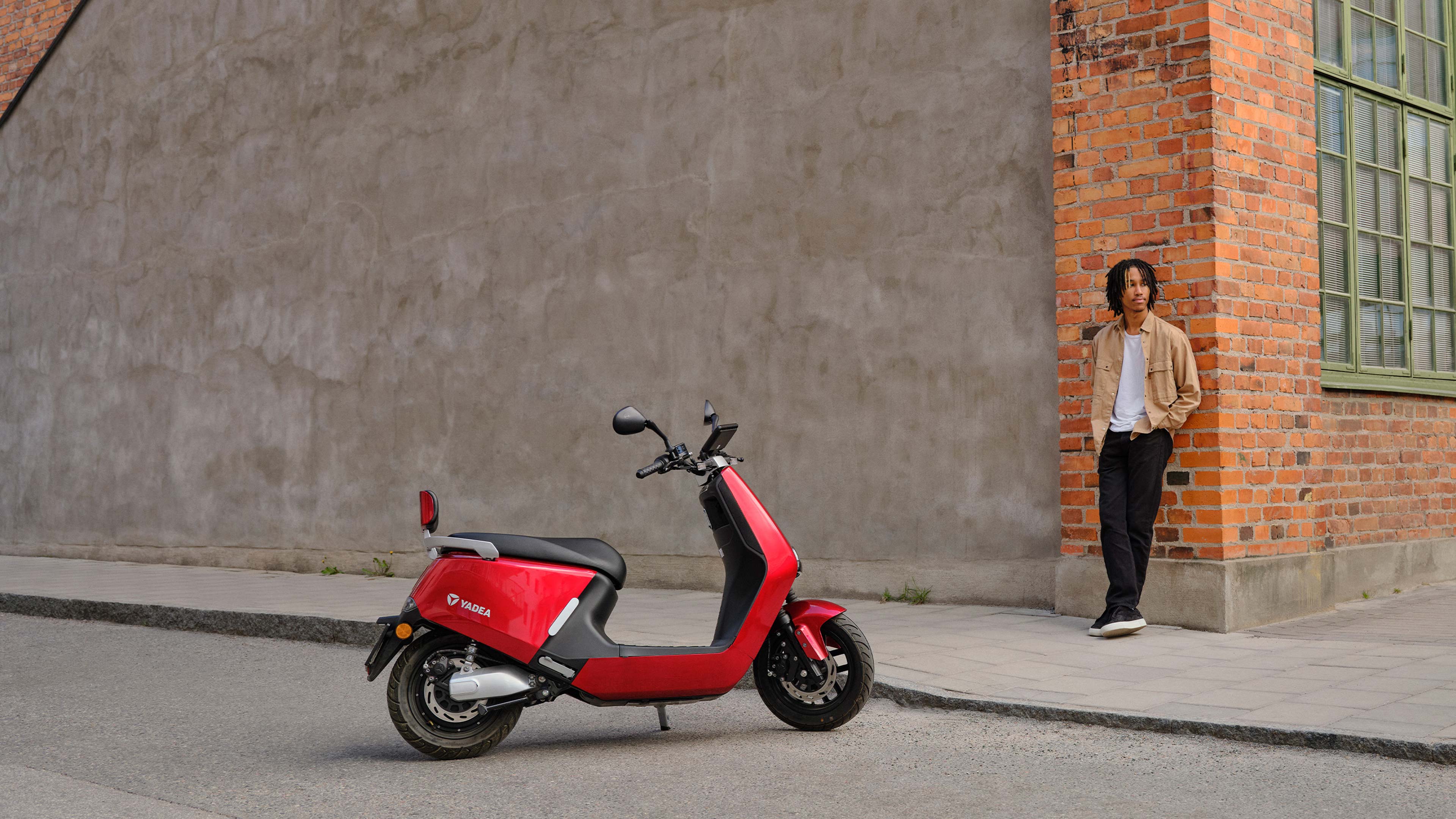
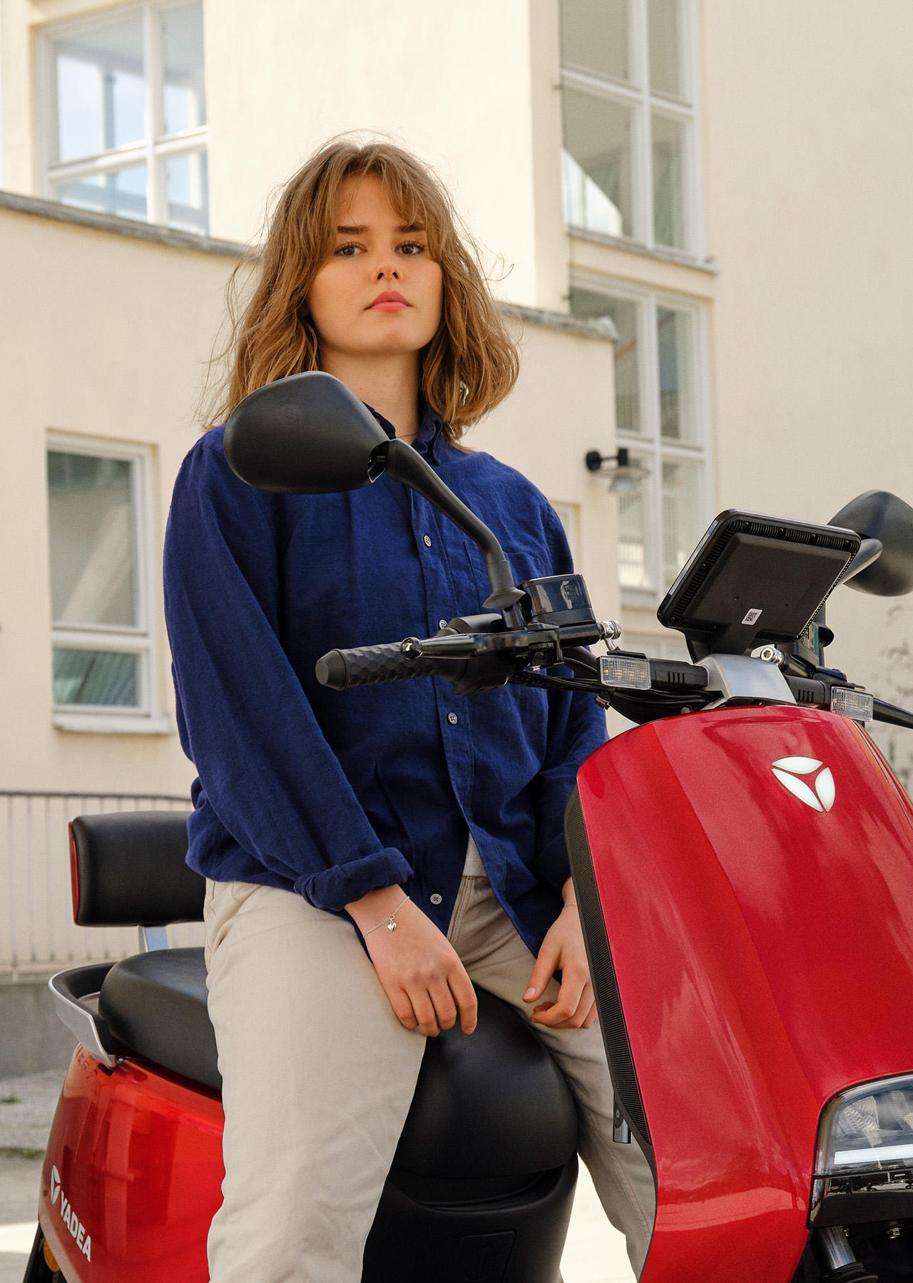
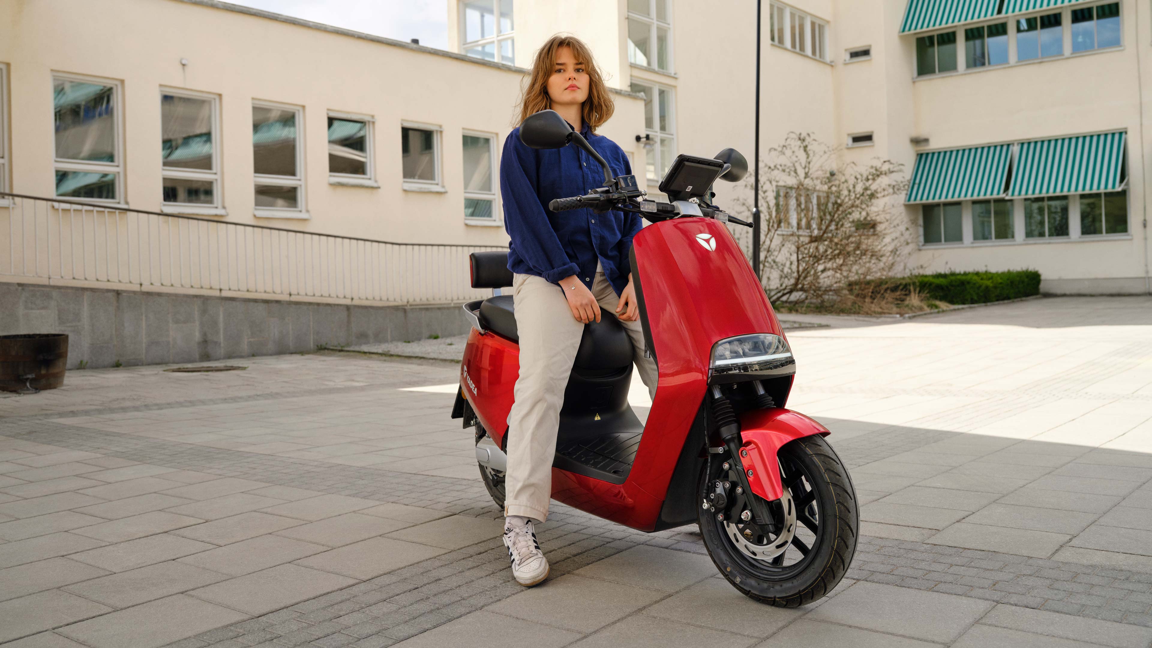
HOJ is Sweden’s largest distributor of mopeds, electrical mopeds and bicycles. As they were launching their brand on the market, they needed a new strategy, name and visual identity. The challenge was to create a distinct and eligible brand for HOJ, that goes beyond technology and product supply and manages to package their product selection in a new and relevant way. In a uniform and sometimes very technical market, HOJ needed an identity strong enough to communicate the brand distinctively and humane as stand-alone elements. With the goal of creating a brand flexible enough to shape both digital experiences and creative communication and speak to an audience consisting of both teenagers and mature everyday commuters.
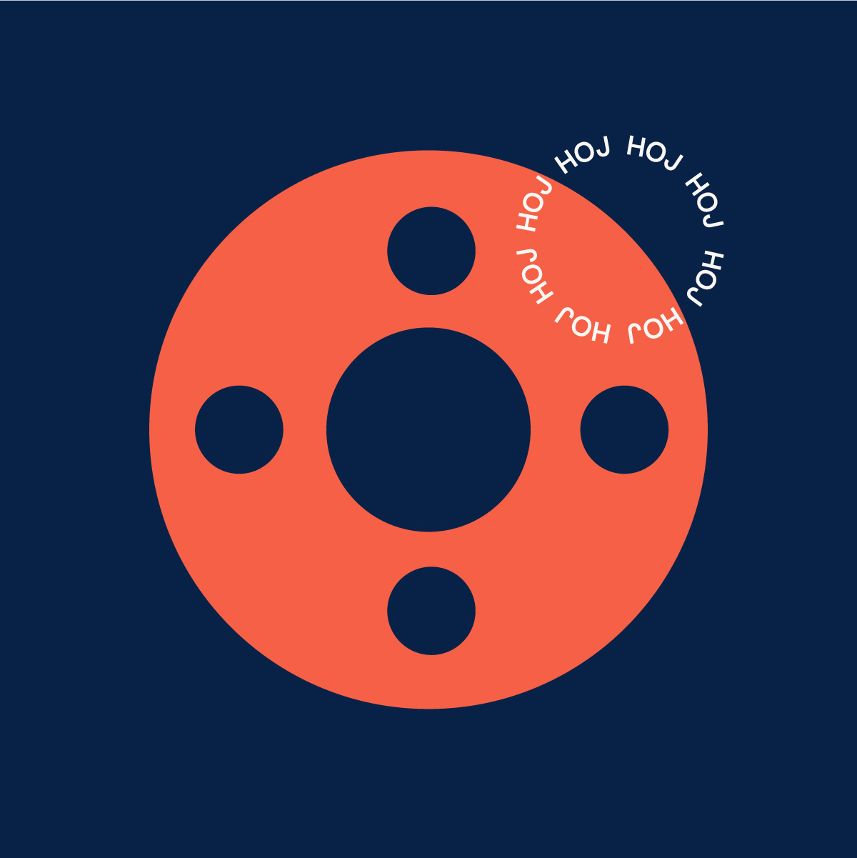
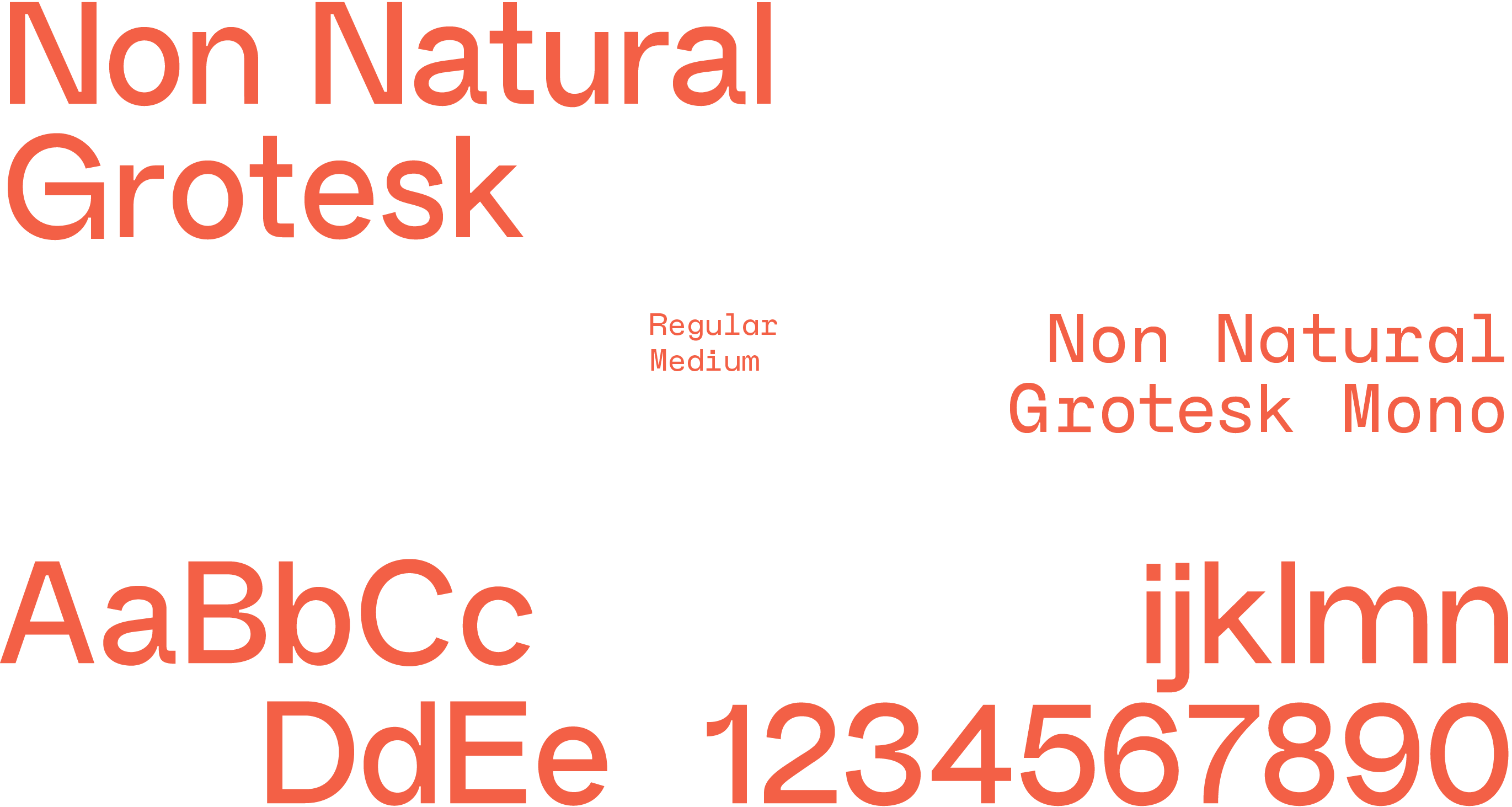
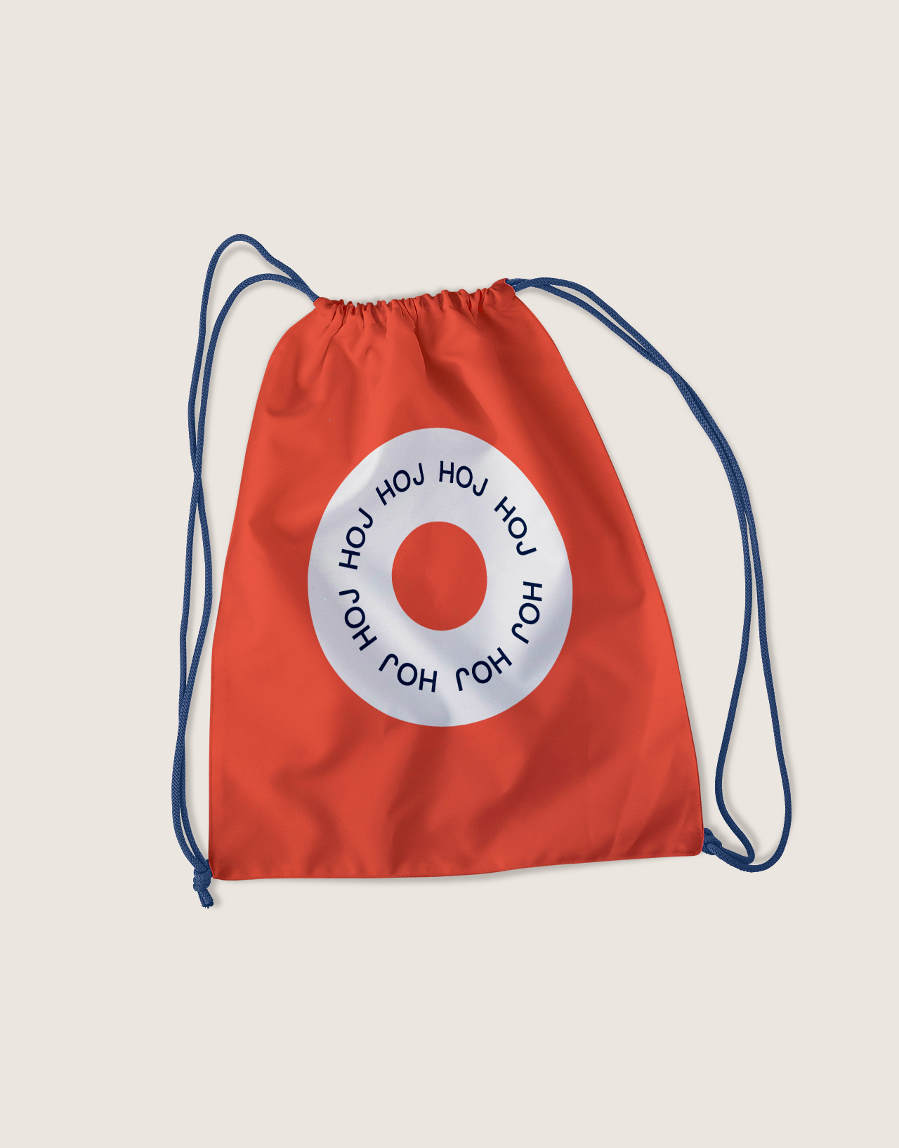
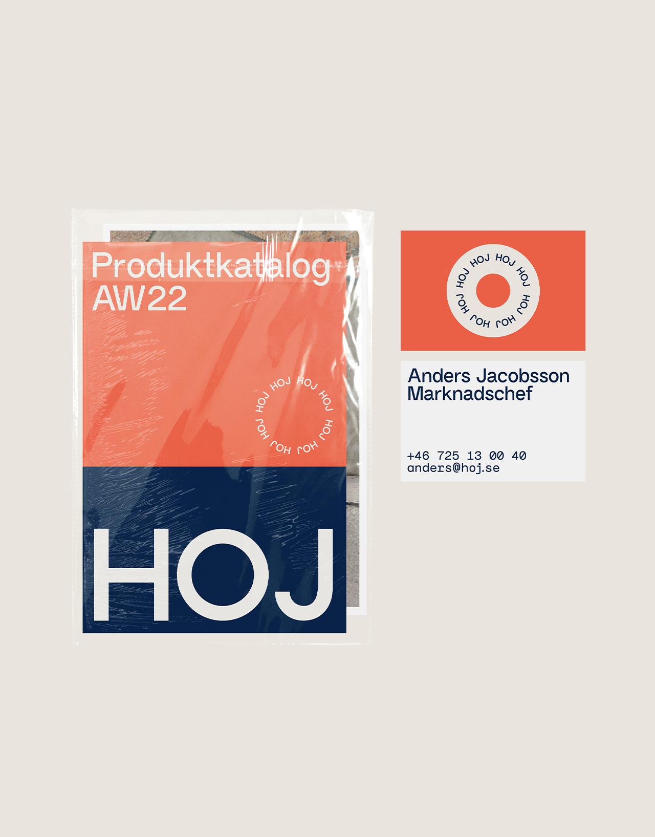
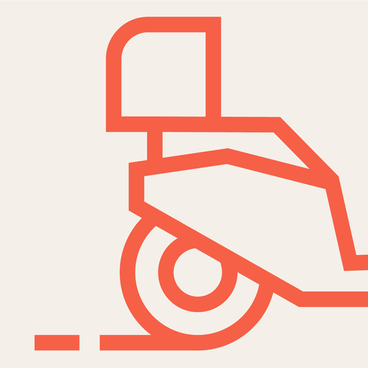
The core of HOJ’s brand is their love and knowledge of two-wheeled vehicles and this is also the essence of their visual DNA.They stand for something bigger – the freedom of getting from A to B however you like. This energy and love for movement is visible in all parts of the identity – from the strong and lively color palette to the wheels and circles of the icons and graphic shapes. HOJ’s new brand photography compliments the visual identity and brings personality and lifestyle to the brand expression.